Best Home Office Paint Colors This Year

One of the fun aspects of having a home office is decorating it however you want, but if design isn’t your bag, you still benefit from knowing about home office paint colors. Your wall color isn’t just an aesthetic choice—it can also boost your productivity, which is the name of the game in a home office. Not all colors do that.
You might ask yourself, “Is that really true?” Yep. I’ve learned it firsthand. I have a long history in residential interior design and had a second career marketing and selling home and office products. Plenty of published theories about color and its related tints, tones, and shades (I explain each definition at the bottom) influence mood and focus, dictating how long you can sit in your office chair and get things done. I cover a few of these theories in my article on choosing paint colors in homes.
In this article, I use these theories to show what makes for good home office colors and which colors are shining this year. Whether you like bright colors or softer tones, you’ll find options here. I also list a few colors to avoid. You may love them, but your workday won’t. But don’t worry; you can still try the colors elsewhere in the home if you like.
Colors For Strong Productivity
You’ll probably wonder whether you can picture yourself working with these colors, and some may not be a good fit. That’s part of the story. In some ways, it is a matter of personal taste. But keep in mind that you can set the temperature by adding tints, tones, and shades. For instance, you can go quite light with each color. I’ll cover this more in a bit. Generally, the more intense the color, the more intense the experience, and the softer the color, the calmer the experience.
Keep in mind that we are also working from home and not in an office, so you may have other room designs you want to match or coordinate with.
White
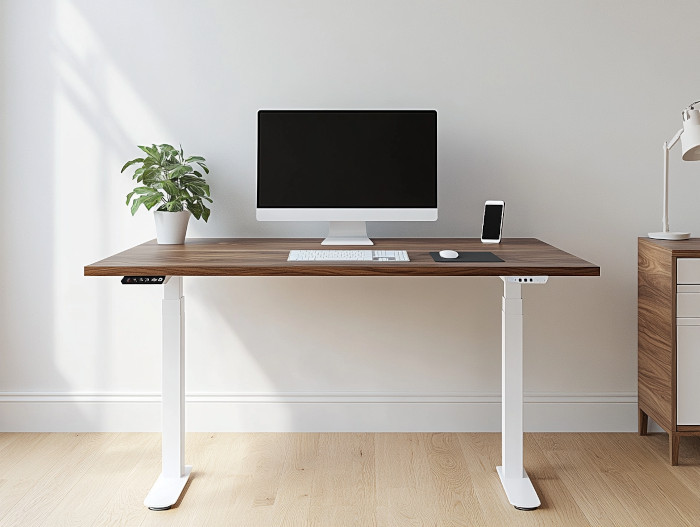
This is by far your safest and most enduring option. It works like a blank canvas for your productivity. It also goes with everything. You can add more color with artwork, furniture, and accessories.
For 2026

This year, Pantone, the leading color trendsetter, is dropping a surprise. Instead of a true color, the company chose a soft white, called Cloud Dancer, as its color of the year. It’s a design response to the world’s craziness, offering a calm, peaceful place to live and work so that the chaos stays limited to news and social media. It’s a creamy, marshmallow-y white that feels like a literal visual reset. It’s crisp enough to keep you focused, but warm enough that you don’t feel like you’re working in a lab. It’s basically the “zen” version of a blank page.
Blues
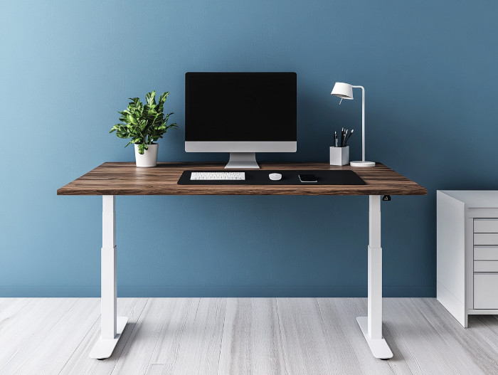
This may seem shocking and odd to include on this list, but I actually worked at an advertising agency with this wall color, and I remember being surprised that it didn’t bother me at all. At the same time, it felt cutting-edge.
Blue promotes focus, calm, and a steady workflow, and you can choose how strong you want it. Light blues can feel airy and relaxed. Darker blues have a sophisticated edge. The color is great for long hours of concentration, as it helps reduce stress and keeps the mind steady.
For 2026

or…

Blue is the ultimate heavy hitter for focus, but for 2026, the experts are moving away from safe, mid-tone “denim” blues. The big trend right now is an icy, frosty feel, like Pinterest’s 2026 pick, Cool Blues. The range of tones works as crisp, almost subzero shades that feel like a palate cleanser.
It keeps the room feeling airy and modern without the heaviness of a dark navy. But if you do want drama, Sherwin-Williams’ Gale Force. It offers a deep, moody blue with real weight.
Greens

Green is one of the more classic colors, and though it can feel old-fashioned, some modern versions feel quite current. Green is associated with nature and renewal, and for some people in the US, it is directly linked to the color of money, equating success and wealth.
Green is great for reducing eye strain during screen-heavy days. Softer greens bring a calming, organic vibe, while richer greens add depth and focus. Pair it with natural wood tones or plants to help you feel grounded and refreshed.
For 2026

Greens are leaning hard into the “Biophilic” vibe. If you’re looking for that “money grows on trees” feeling, check out the deeper, smoky jades. The trend is leaning toward what people are calling “Smoky Jades.” A huge standout is Behr’s Hidden Gem. It’s a moody, sophisticated blend of green and blue that feels like a forest at twilight.
What’s great about these new greens for a home office is that they aren’t just for looks—they’re “science-backed” to reduce eye strain and calm your nervous system. If you don’t want a stuffy old library, try one of these mid-tone jades. Pair it with some light wood furniture and a few actual plants, and you’ve got a workspace that feels like a retreat.
Reds

Red has both positive and negative connotations. Typically, the stronger it is, the more negatively it is received. You may need to add a tint, tone, or shade to reduce its vibrancy. It can be quite rich and inviting when done well. I’ll cover this in more detail in the article.
For 2026

A major pick for this year is Sherwin-Williams’ Dark Auburn. This is a stunning, wine-rich red with chocolatey undertones. It’s deep and moody, but because it’s so grounded, it creates a “cocoon effect” that can actually help you settle into deep work. It gives you all the confidence and drive red is known for, but with a more sophisticated, established edge.
Yellows

Yellow is basically sunshine in a can. It’s all about optimism and energy, and in a home office, it sparks creativity while keeping your spirits high during long tasks. Soft buttery yellows can help keep the color from overwhelming everything. If you like going bold, use this color sparingly, like on an accent wall; otherwise, it is simply too overpowering. It can work as a nice counterpoint to gloomy weather and dark corners of the home, keeping life more cheerful and inspiring.
For 2026

If you’re looking for a yellow that feels established rather than “trendy,” look no further than Benjamin Moore’s Marblehead Gold. It’s part of their Historical Collection, but it’s seeing a massive resurgence for 2026. Think of it as a rich, sophisticated gold that works in a professional setting.
Marblehead Gold stays deep and buttery. It’s an incredible choice for a home office because it hits that “optimism” note perfectly without feeling childish. It looks especially high-end when paired with crisp white trim (Swiss Coffee) or even some of the darker charcoals we’ve discussed. If you want your office to feel like a timeless, sun-drenched library, this is the one to beat.
Oranges

Orange joins the energy of red with the optimism of yellow. It’s a pretty lively, social color that works well in spaces where brainstorming or collaboration happens, but like yellow, strong tones can be overpowering. A soft terracotta orange or a muted peach is more manageable day in and day out, and they pair nicely with Scandi and mid-century modern furniture.
For 2026

Oranges are heading into sunbaked tones this year, with Farrow & Ball’s 2026 Marmelo as the standout. Unlike the vibrant oranges of the mid-century modern era, this muted, earthy version is grounded and organic. Use it to mimic natural clay and sunlight, which helps maintain energy levels without the “jittery” feel of brighter oranges.
Pinks

Pink might not be the first color you think of, but it can be surprisingly effective. Generally speaking, though, the softer the better. Soft blush tones create a warm, calming environment that feels inviting without being distracting. Pinks can also add subtle sophistication, especially when paired with neutrals like gray or beige. Brighter pinks usually feel too energetic for productivity, so reserve them for accent walls, furniture, or artwork.
For 2026

This year is about complex blushes like Sherwin-Williams’ Rose-Colored Glasses. It’s a dusty, sophisticated pink with heavy gray undertones. If you love pink, this color works great for home offices because it provides a warm, flattering light for video calls without being visually distracting. It functions more like a warm neutral than a “bright” color.
Colors Designed for Calming Comfort
Everyone is a bit different, so colorful walls may be too distracting for you. Another factor worth considering: home offices are used differently from business offices. At home, we need to feel comfortable day in and day out, even when not working, and we may use the space for other purposes. In these cases, neutrals work extremely well and suit all home and office design styles. You can add more color if needed through furniture and accessories. Unless your workspace is dedicated to work, strong colors may not be the best match.
White
Yep, were’ back to white again. A classic. But keep in mind that white isn’t just white. A bright white can read as jarring in some settings, but you can create softer shades to soften the look and make life more comfortable.
For 2026
As I mentioned at the top of this article, Pantone’s Cloud Dancer is the standout this year, finally providing the calmness we need to balance out world chaos.
Gray

Like white, gray goes with everything. But it is also less jarring than white and timeless, adaptable, and professional. You get a calm backdrop that won’t distract you from your work; in fact, you may want to stay there longer. And if you like strong colors, it works well alongside them.
Lighter grays keep a room open and airy, while darker charcoals add depth and sophistication. In home offices, gray is a safe choice if you want a modern look that won’t compete with furniture or art.
For 2026

If you’re a die-hard gray fan, don’t worry—it’s not “out,” but it has definitely evolved. Experts are moving away from cold, industrial grays and toward sage grays and warm charcoals. A great 2026 pick is Benjamin Moore’s Silhouette. It is one of the eight core colors in Benjamin Moore’s official 2026 Color Trends palette, curated by their lead designers. It’s a sophisticated gray with added warmth.
Beige
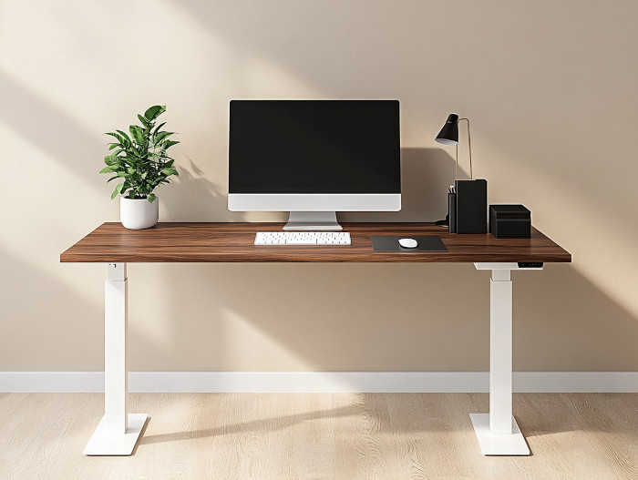
Beige is another popular neutral, but unlike gray, it is softer and more inviting. It works especially well in multipurpose home offices, blending easily with a variety of design styles while still feeling homey.
Light beige shades create a relaxed, cozy atmosphere, while deeper beige tones add richness without pulling focus. If you want comfort with a touch of warmth but still need a professional vibe, beige is a dependable choice.
For 2026

If you feel like you’ve seen the 2026 beige before, you’re not wrong—the 90s are officially back! The nostalgic neutral feels warm and grounded. We’re seeing a return to colors like Sherwin-Williams’ Universal Khaki. It’s a true, sandy beige that doesn’t apologize for, well, being khaki. It’s a great pick for a home office because it feels “homey” and established, rather than the cold, temporary feel of the grays we’ve lived with for the last ten years.
Colors to Avoid
Dark colors, though sometimes visually rich, aren’t the best for productivity. Browns and purples will slow you down.
Browns

If going with brown, generally speaking, the lighter the better. It can be beautiful, but it sucks energy away, so it’s better suited to a study or library.
Purples

Purple not only draws energy down, but the more vibrant tones can also be extremely distracting.
Blacks

I write a lot about masculine design, and this is about as masculine as it gets, but while black and charcoal have become popular these days and inject some masculine sophistication, over time, black will weigh you down and make your space feel small. You will likely change it up sooner than you planned. If using black, it’s best to limit it as much as possible. If you still insist, you’re in luck. This year, the charcoals are getting slightly browner and grayer, which is why I include Benjamin Moore Silhouette above in the gray recommendations.
Why Color Matters
It’s because of color psychology. Certain colors and tones evoke specific energies and feelings.
Warm Colors (Red, Orange, Yellow): These colors are energizing and stimulating and can boost creativity and motivation. They also have a playful quality, much like primary colors, which is why they are often used in modern and mid-century modern styles. But use the colors with caution. They can easily feel overwhelming. You may do well to use them on specific walls or furniture, rather than all the walls in a room.
Cool Colors (Blue, Green, Burgundy): These evoke calm, focus, and tranquility, making them ideal for reducing stress and improving concentration.
Neutral Colors (White, Gray): These provide a sense of calm that aids concentration, as well as balance and sophistication, and they complement most other items in the room. They also evoke a natural feel, which has made them popular in Japandi (LINK).
Dark Colors (Navy Blue or Dark Green): These can add sophistication and depth.
Color theory can also explain why color matters, and one popular model is the Four Colors of Emotion.
The Four Colors of Emotion and How They Relate to Home Offices
The following primary colors are the building blocks of all colors, so you can use them to create lighter or bolder versions, build primary, secondary, or tertiary color schemes, blend them with other colors to create specific tones, and identify complements.
Here’s a breakdown of the emotional impact of these four primary color categories:
1. Red: The Color of Energy and Passion
Red is a high-energy color associated with excitement, strength, and urgency. It can invigorate and stimulate creativity, making it a great choice for accent pieces in a home office. However, too much red can feel overwhelming, so use it sparingly—think a red chair, lamp, or artwork.
How it works in a home office:
- Boosts energy and motivation during long workdays.
- Encourages confidence and bold decision-making.
2. Blue: The Color of Calm and Focus
Blue is known for its calming and stabilizing effects. It evokes feelings of trust, serenity, and dependability, making it one of the most popular colors for professional environments. From pale sky blue to rich navy, this versatile shade helps maintain focus and reduce stress.
How it works in a home office:
- Enhances concentration during detailed tasks.
- Creates a sense of calm during high-pressure meetings or deadlines.
3. Yellow: The Color of Optimism and Creativity
Yellow is bright, cheerful, and associated with positivity and innovation. It sparks creativity and uplifts your mood, making it an excellent choice for brainstorming areas or collaborative workspaces. Too much yellow, however, can cause overstimulation, so use it thoughtfully.
How it works in a home office:
- Inspires out-of-the-box thinking and problem-solving.
- Brightens a space and boosts morale on cloudy days.
4. Green: The Color of Balance and Renewal
Green embodies nature, growth, and harmony. It’s a restful color for the eyes and promotes balance and well-being. Green is perfect for home offices where you want to reduce stress and maintain a healthy work-life mindset.
How it works in a home office:
- Encourages relaxation without sacrificing focus.
- Connects you to the outdoors, especially when paired with plants or natural light.
Hues, Tints, Tones, and Shades
On a color wheel, you will also see indications for hues, tints, tones, and shades for each color.
Hues
Color hues are primary colors and how they combine to create other colors.
- Primary colors are basic colors, like red, blue, and yellow.
- Secondary colors are made by combining primary colors. Orange is red and yellow combined, green is blue and yellow combined, etc.
- Tertiary colors combine secondary colors even further, like an orangy red or a greenish yellow
On a color wheel, they are the main colors you see in the circle captured by the triangular cutouts.
Tints, Tones, and Shades
These three traits are among the most critical aspects of color because each can evoke specific emotions and influence a room’s comfort. For example, lighting a red creates a lighter, friendlier feel in a room, but darkening a red creates a richer, more personal experience.
Here’s an example of the difference in reds. One is more energized, while the other is calmer.


Here is how to add tints, tones, and shades:
- Tints: add white to a color
- Tones: add gray to a color
- Shades: add black to a color
How to Apply Paint Colors in a Home Office
Here is how you can maximize or minimize the benefits of colors in your workspace:
- The 60-30-10 rule: Designers often adopt tertiary palettes and follow the three-color rule:
- A dominant color occupies 60% of the space, primarily on walls and cabinets. It is often a neutral base with enduring undertones, making it easier to change out the other two colors over time as trends come and go.
- A second color accounts for an additional 30%, typically used on furniture or backsplashes.
- A third color is used for the remaining 10% at the designer’s discretion.
- Accents vs. Walls: Accent walls can be any color, but they help reduce the overall intensity of a strong color in a room, allowing for bolder colors if you like.
- Layering Colors With Complements: As part of the 60-30-10 rule, try adding spots of complementary colors to round out a room’s feel. You can use bold complements to add color and energy, or soft ones to soften it.
- Lighting Matters: Natural and artificial light will affect how these colors appear and how you perceive them throughout the day. In general, colors appear darker in dark or dimly lit spaces. The opposite happens for lighter rooms.